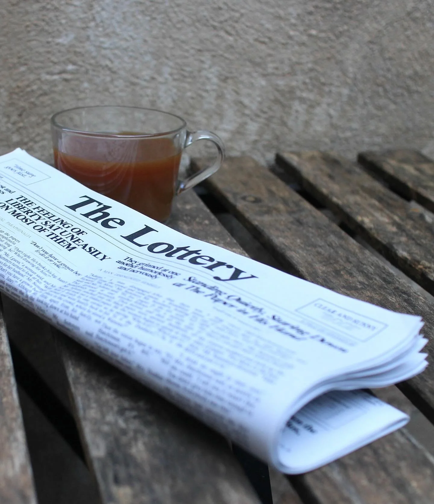

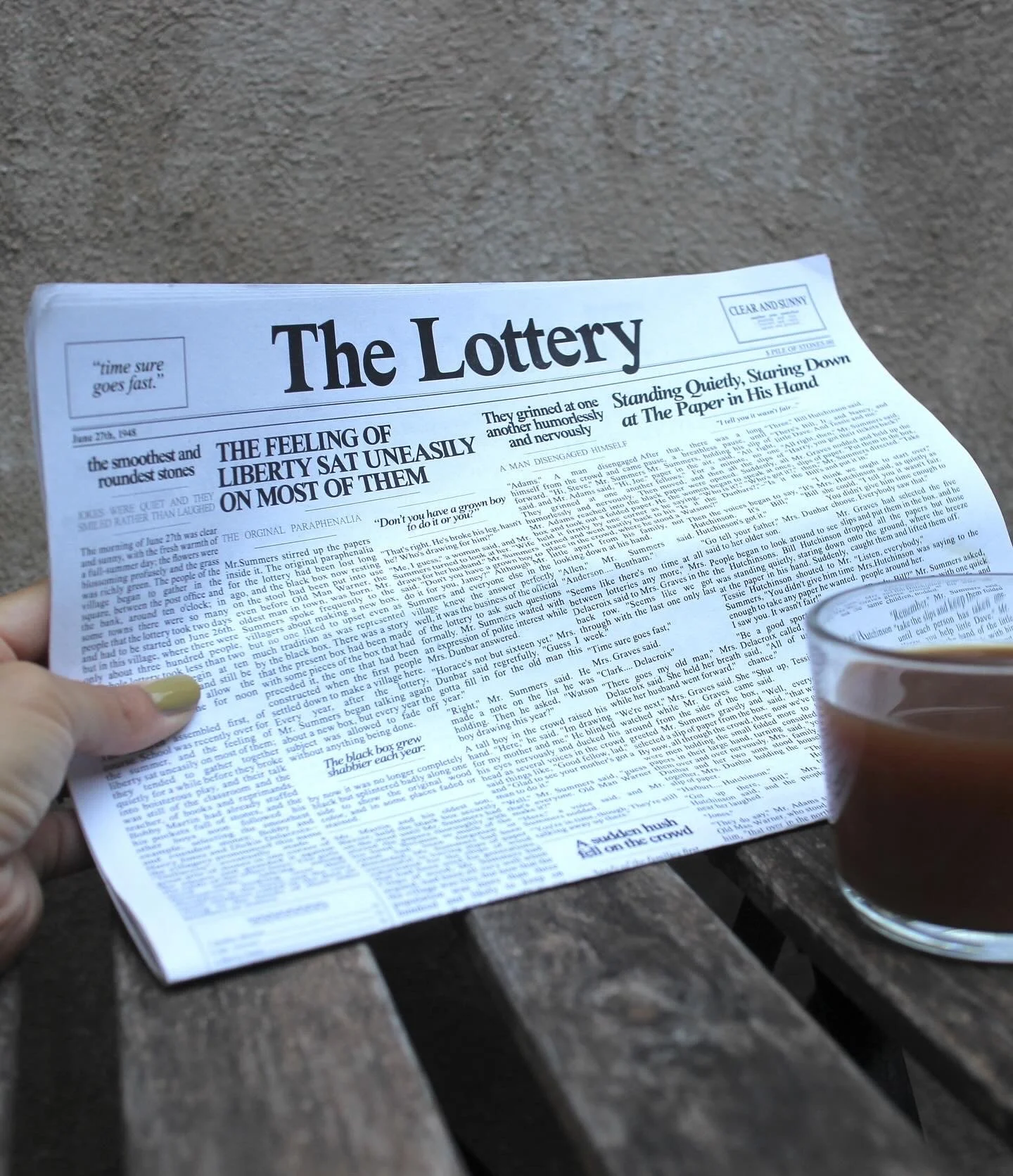
‘THe Lottery’
An editorial design to express the sentiment of the fictional story by Shirley Jackson. this design portrays a stark reflection of history repeating itself.


EDITORIAL DESIGN
this project was a highly detailed, grid based editorial design. The layout almost replicas the New York Times grid from the 1940’s.
Our design process was mentored by Mark Bohle, award winning designer practicing in Barcelona.
The Lottery: editorial design with Mark Bohl
We worked within the parameters of designing solely with New Times Roman font and solely in black and white. The constraints leaned this work into a decisive and intentional result. The iteration of telling a fictional story through the layout of a newspaper communicated a theme of repeating the past in American culture. The story takes the reader through a grim picture of how historically, group think can lead to traditions that can be quite cruel and nonsensical. The news shares stories like this everyday and has for decades. Each printed page is a copy of the first and they are stacked to imitate a role of the morning’s news. The paper chosen is a recycled, 80 gr weight paper with a closely similar feel to newspapers.
This experience was a strong lesson in how powerful editorial design is. A layout can connect strongly to the copy and purvey the content with a powerful delivery. Editorial is an important tool in design to communicate the content in an effective manner.