
design portfolio
Exploring to create.
RECENT WORK
〰️
RECENT WORK 〰️
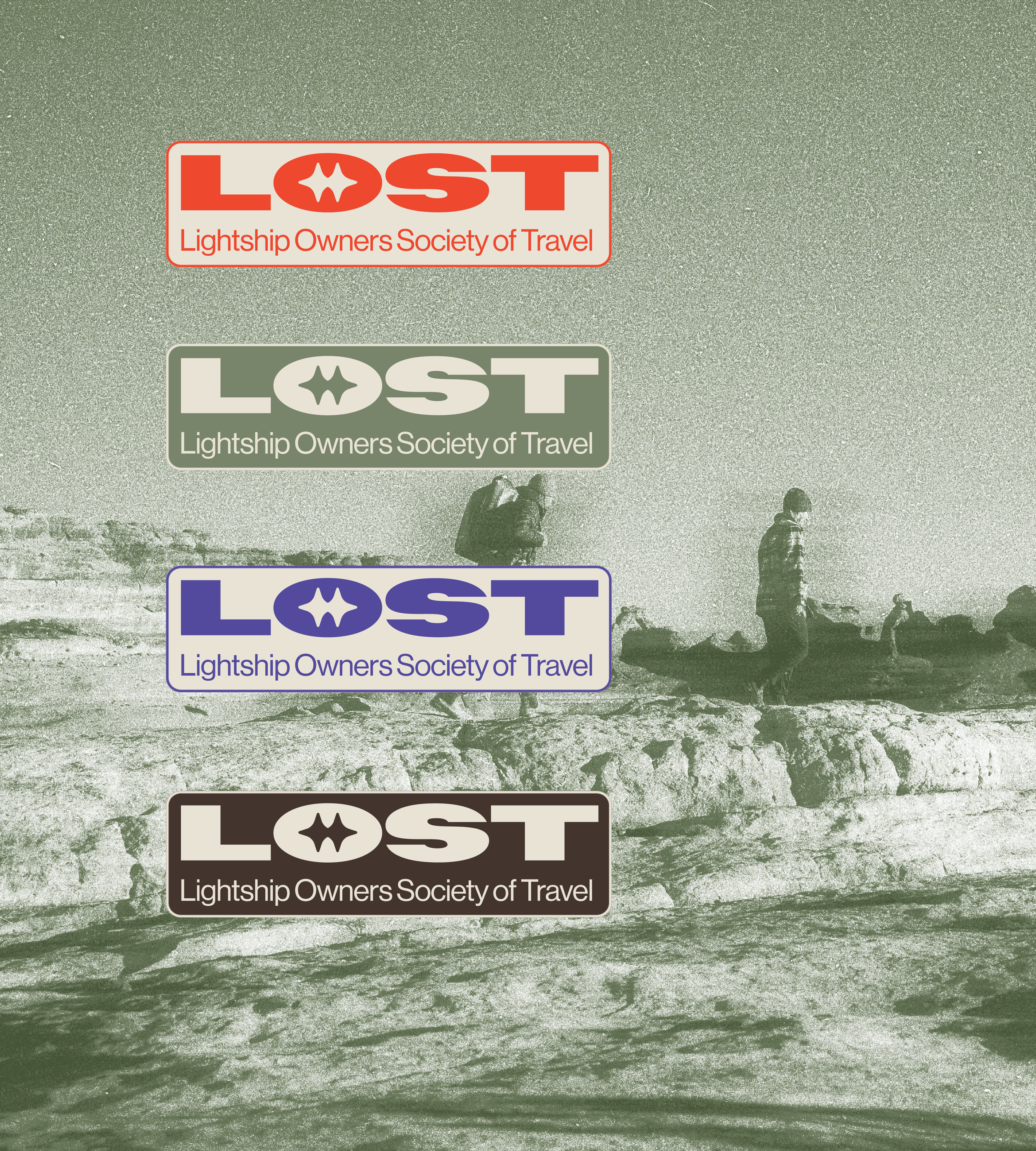
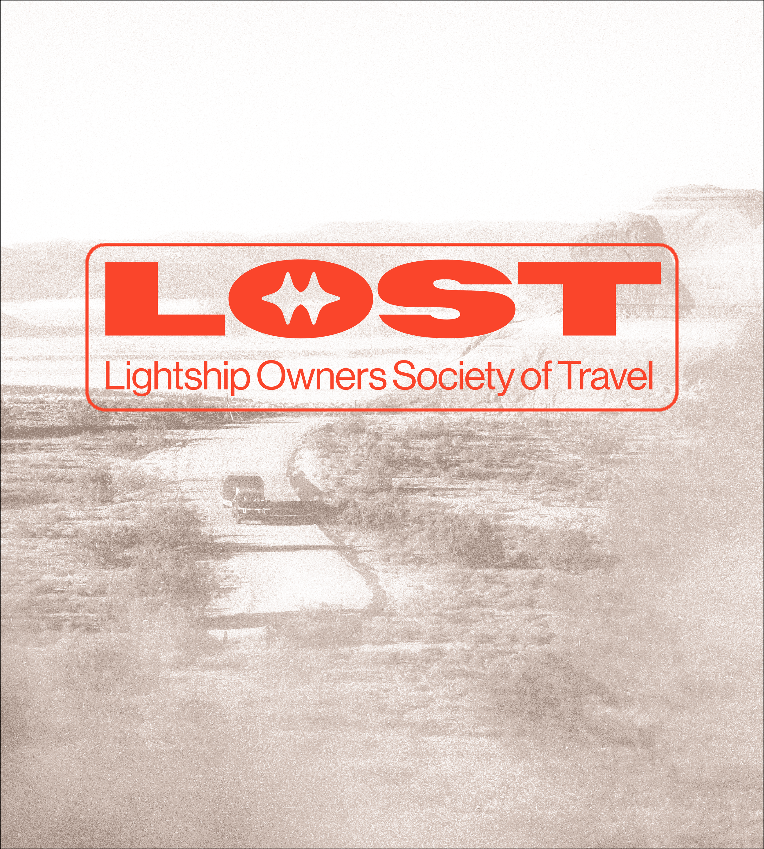
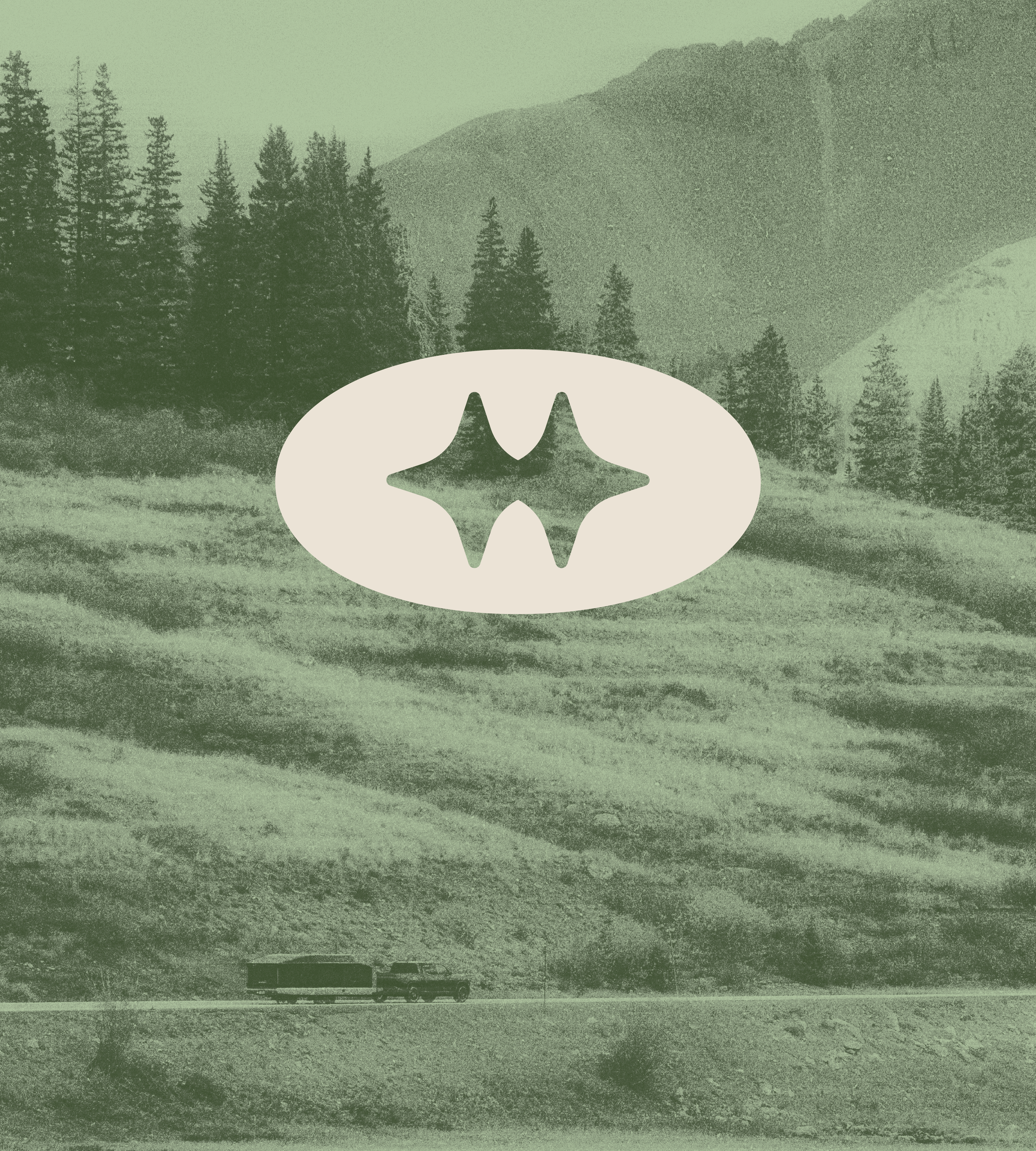
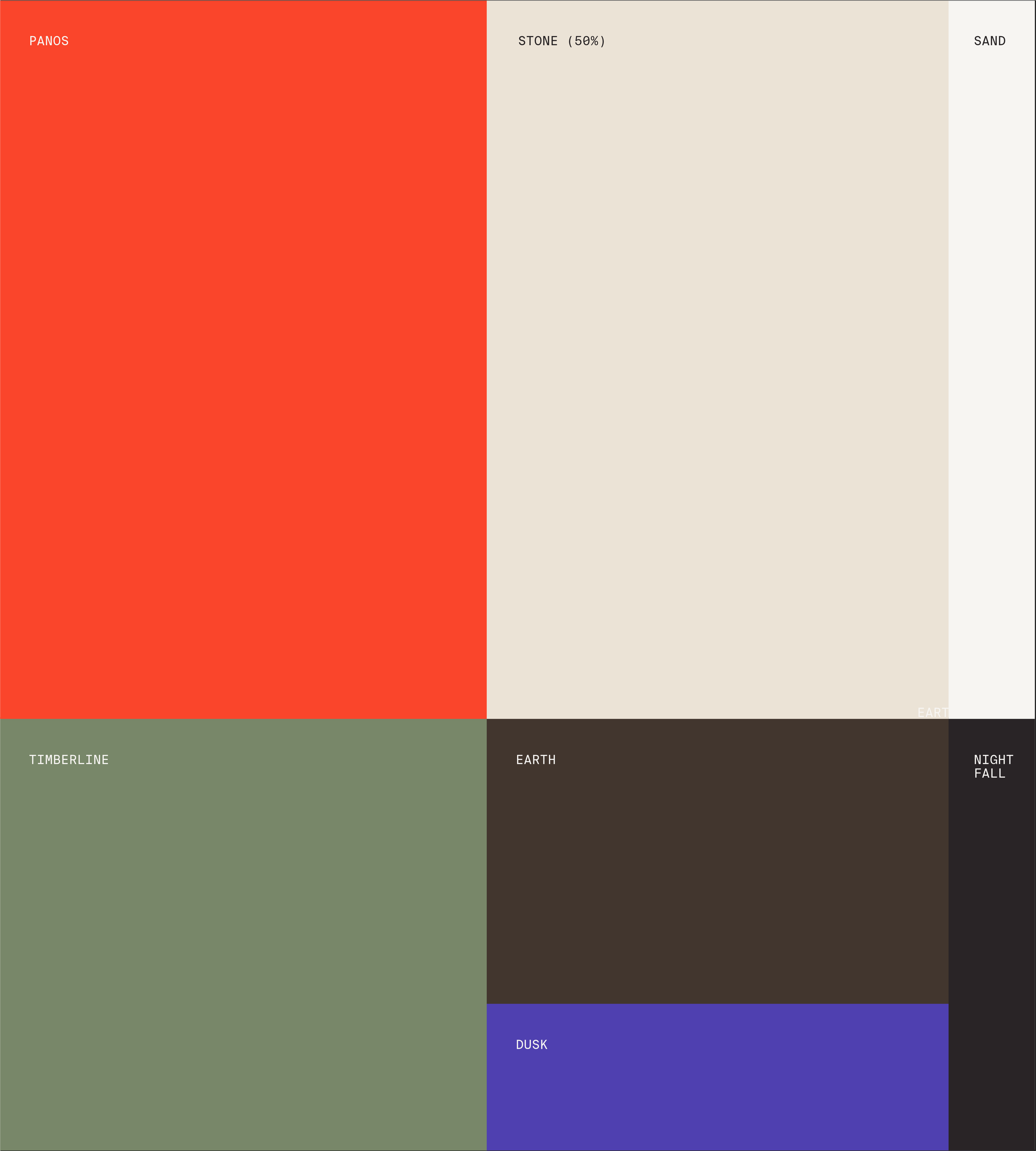
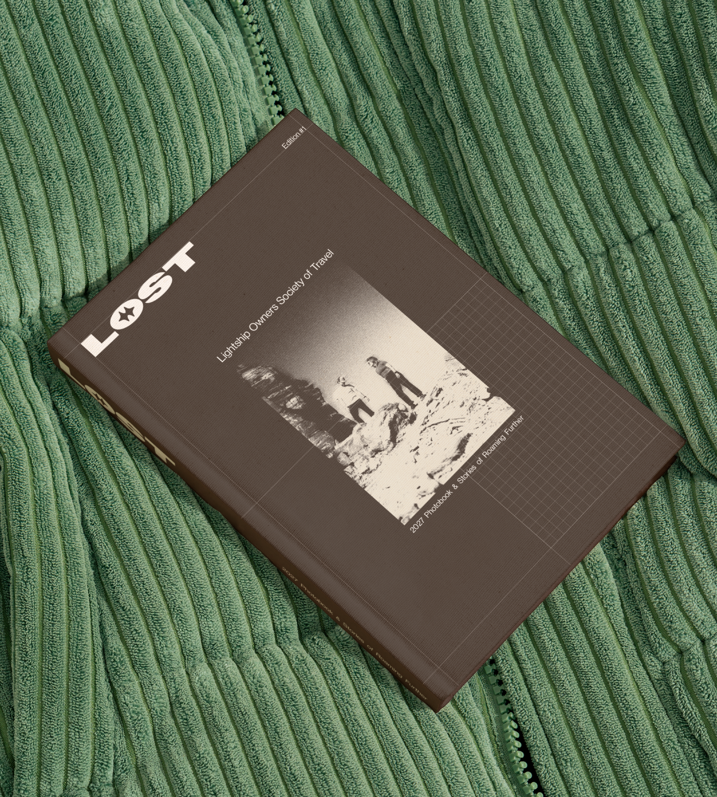
LIGHTSHIP OWNERS SOCIETY OF TRAVEL
BRAND GUIDE & VISUAL IDENTITY
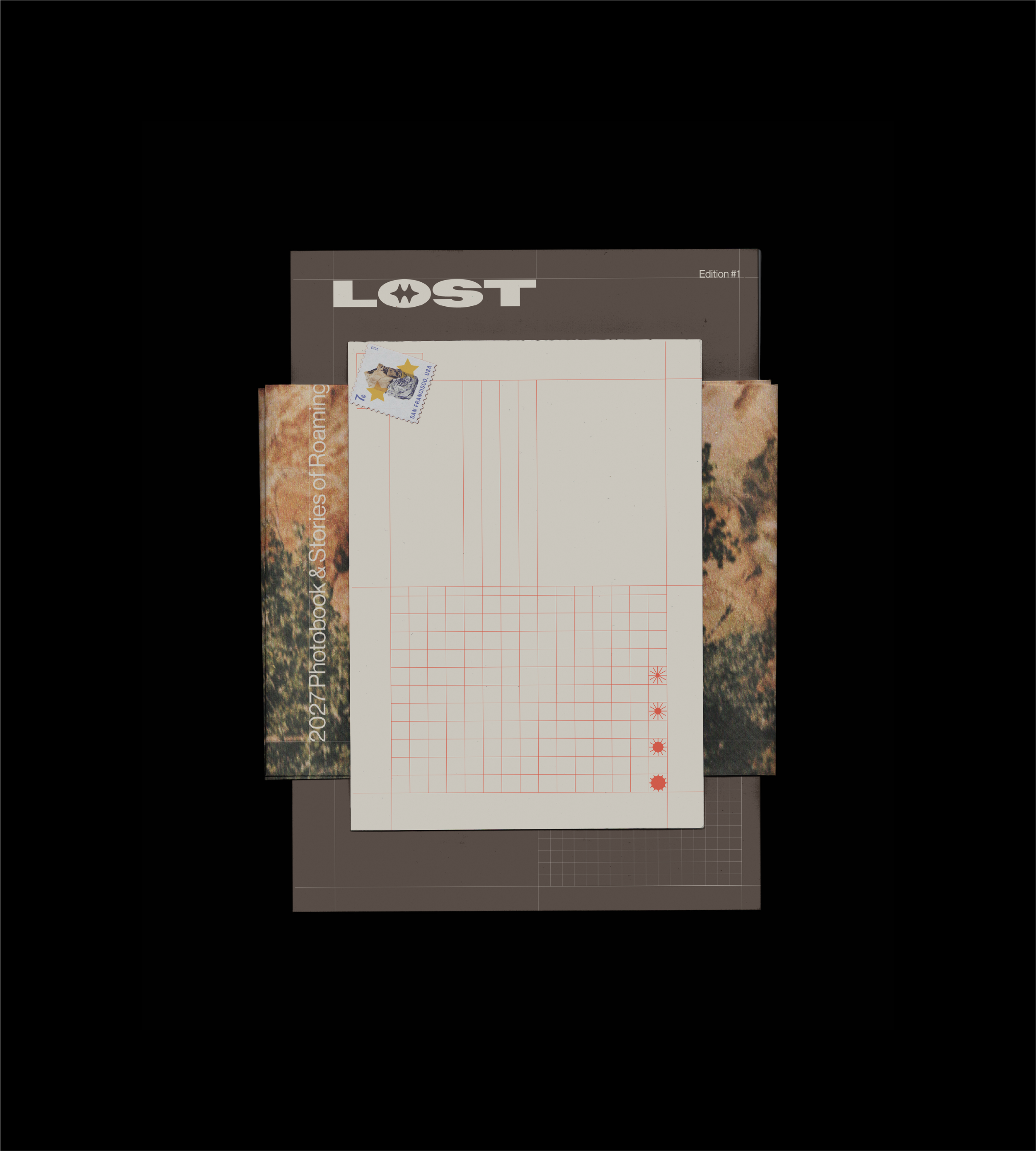
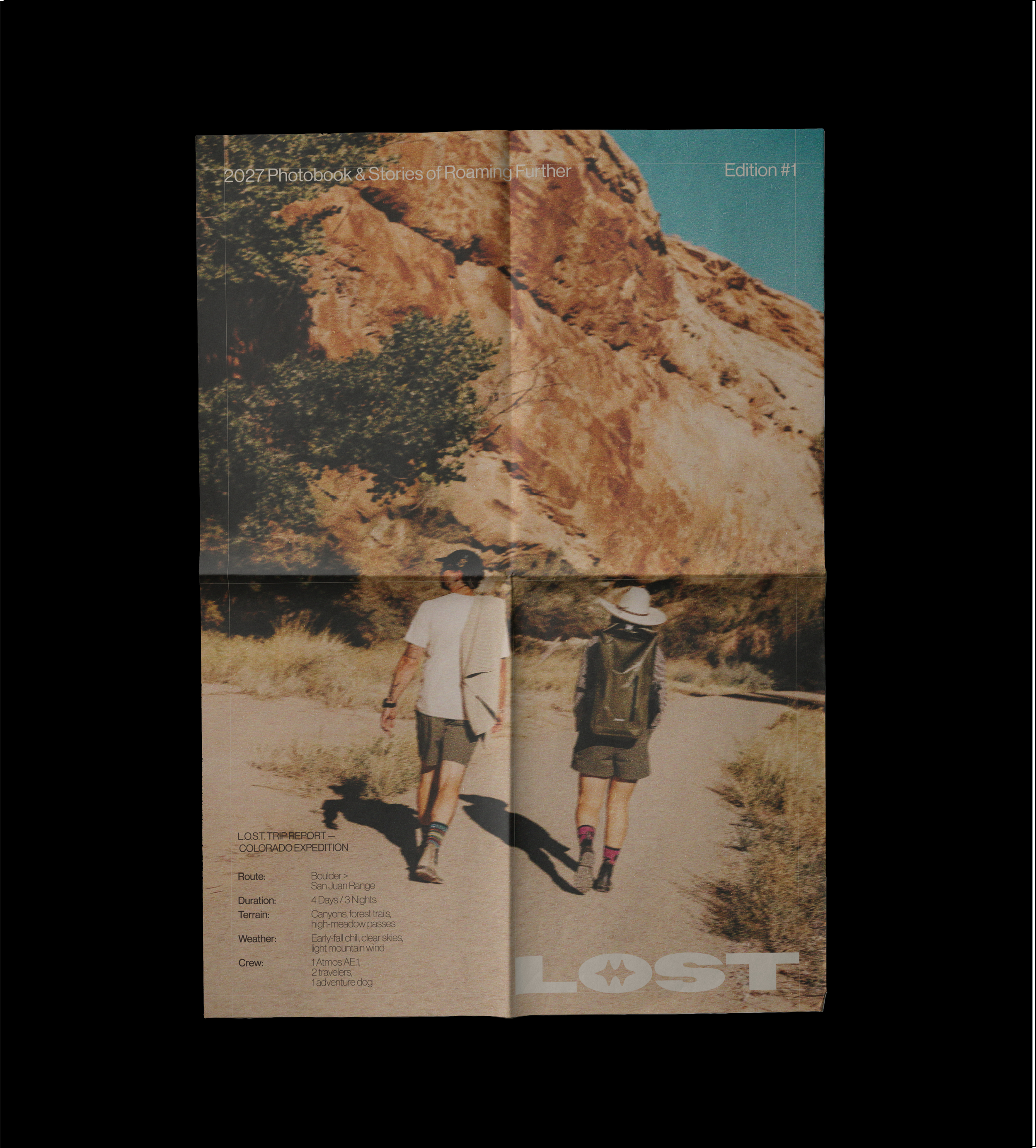
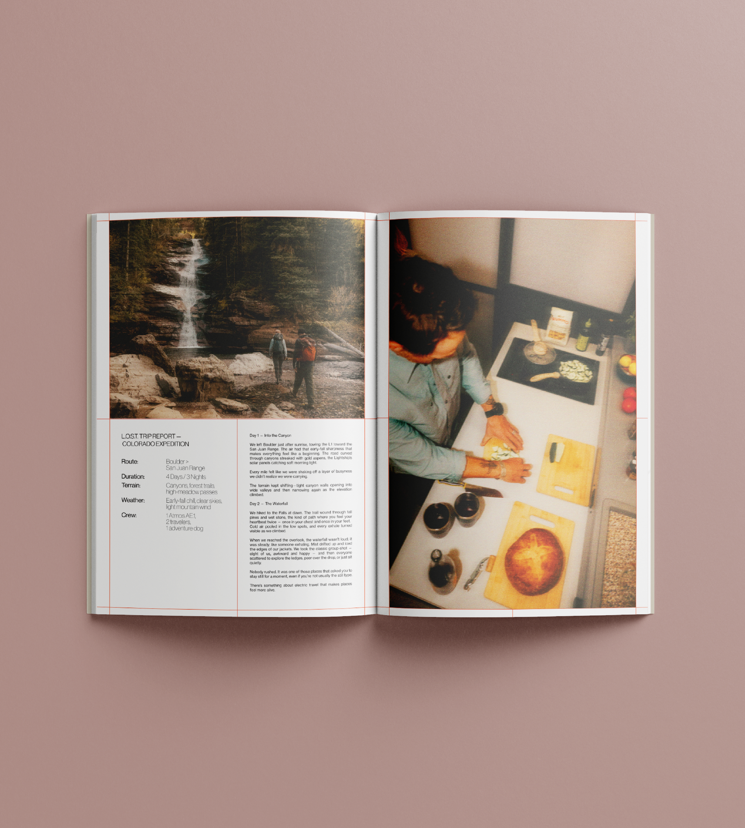
LIGHTSHIP OWNERS SOCIETY OF TRAVEL
Lightship Owners Society of Travel is Lightship’s exclusive community for owners, celebrating the spirit of electric exploration and connection. L.O.S.T. exists to foster community, deepen the ownership experience, and create a lasting sense of belonging.
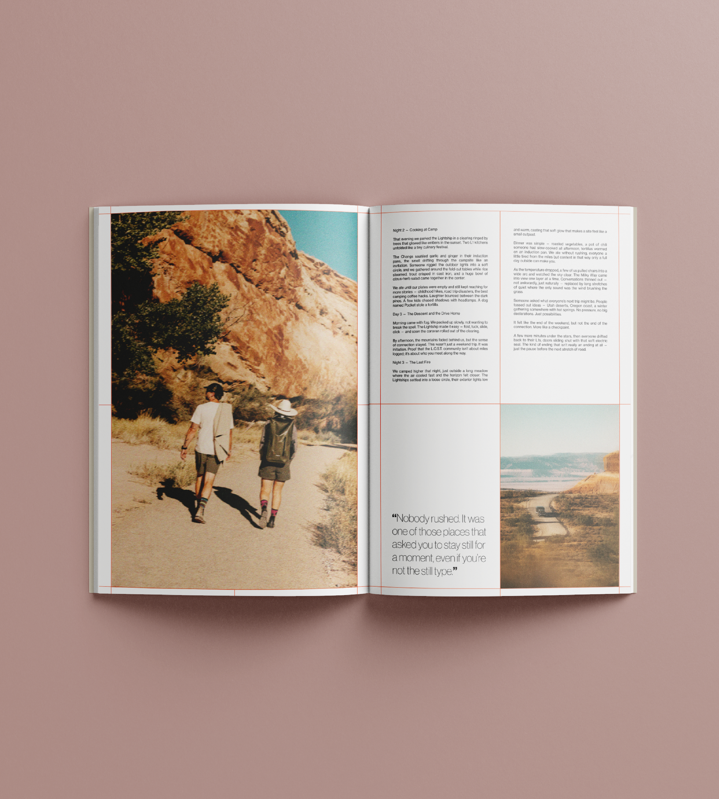
The visual system draws from the utility of a field manual and the nostalgia of the road, using worn, traveled photography and retro nods in illustrative assets.
This work was completed collaboratively with the direction of Samantha Parris, Creative Director at Lightship RV and the logo was designed by visual creative, Jess DePaul Ariail.
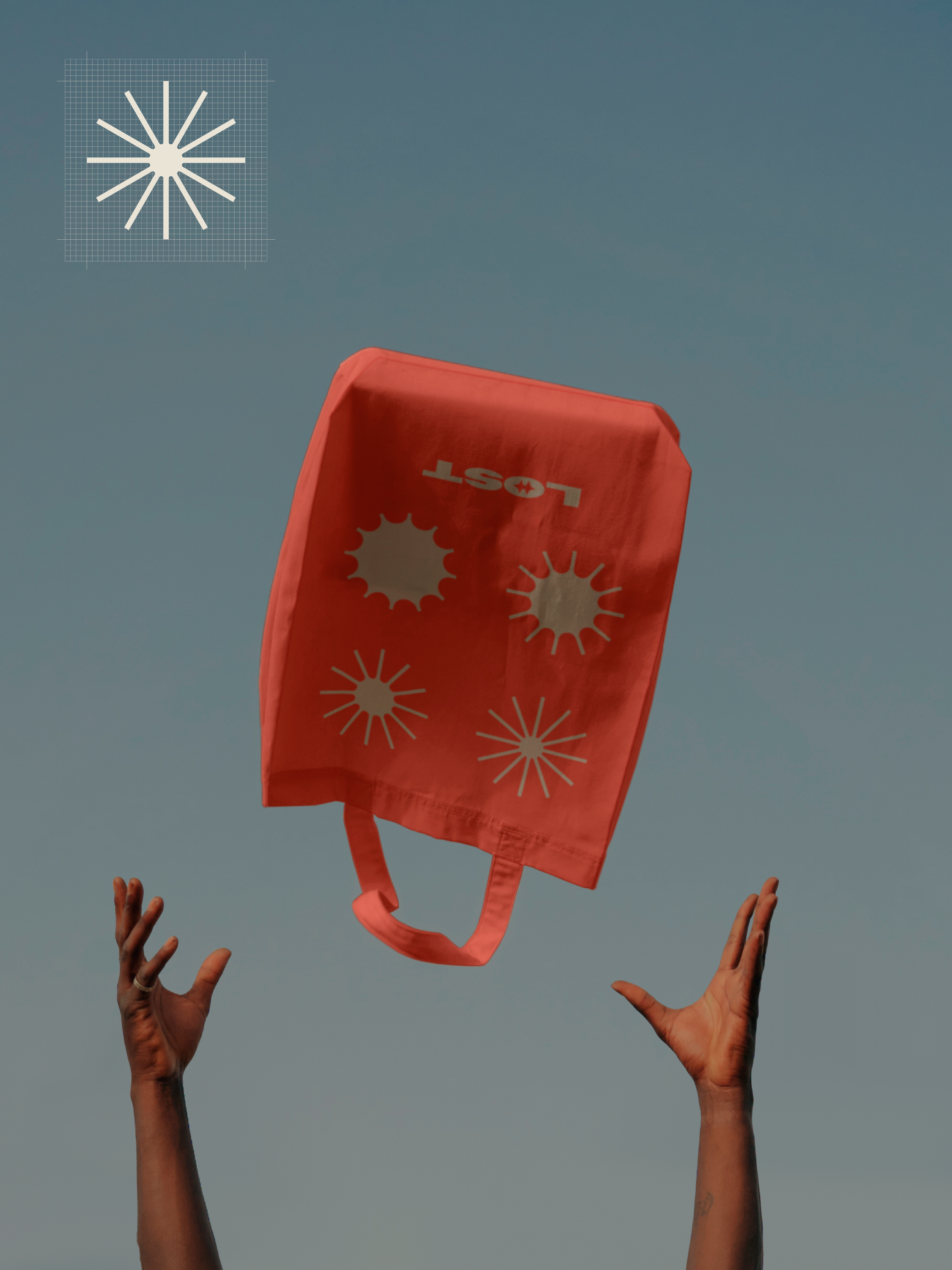
print & editorialPrint and digital play distinct but equally important roles within the L.O.S.T. system, working together to shape a cohesive ownership experience. Print brings weight, tactility, and permanence—echoing the feel of field manuals, maps, and collected road ephemera—while digital provides immediacy, utility, and an ongoing point of connection for the community.
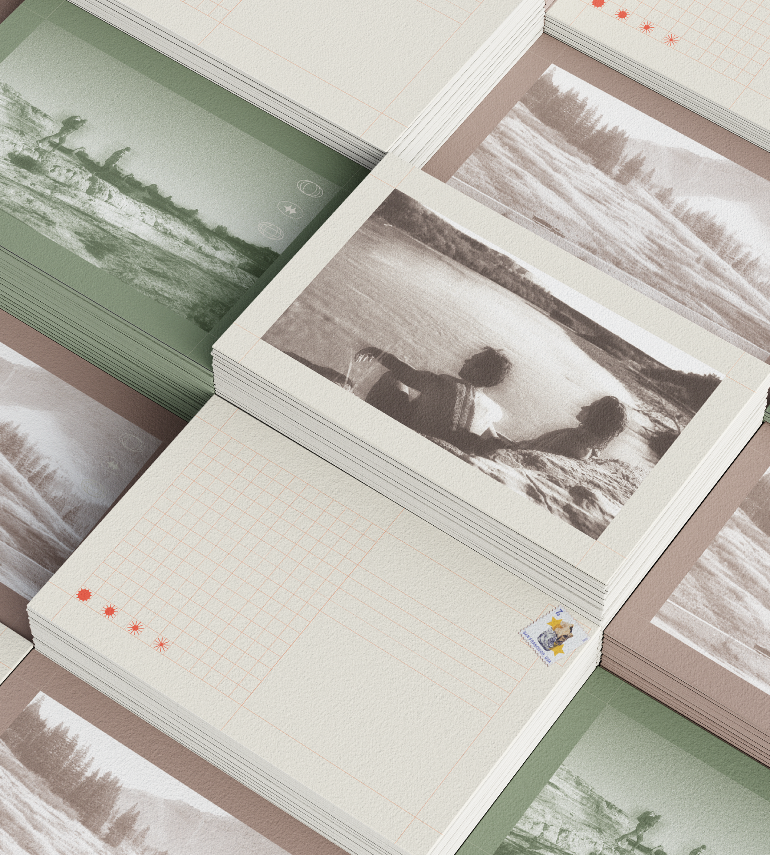
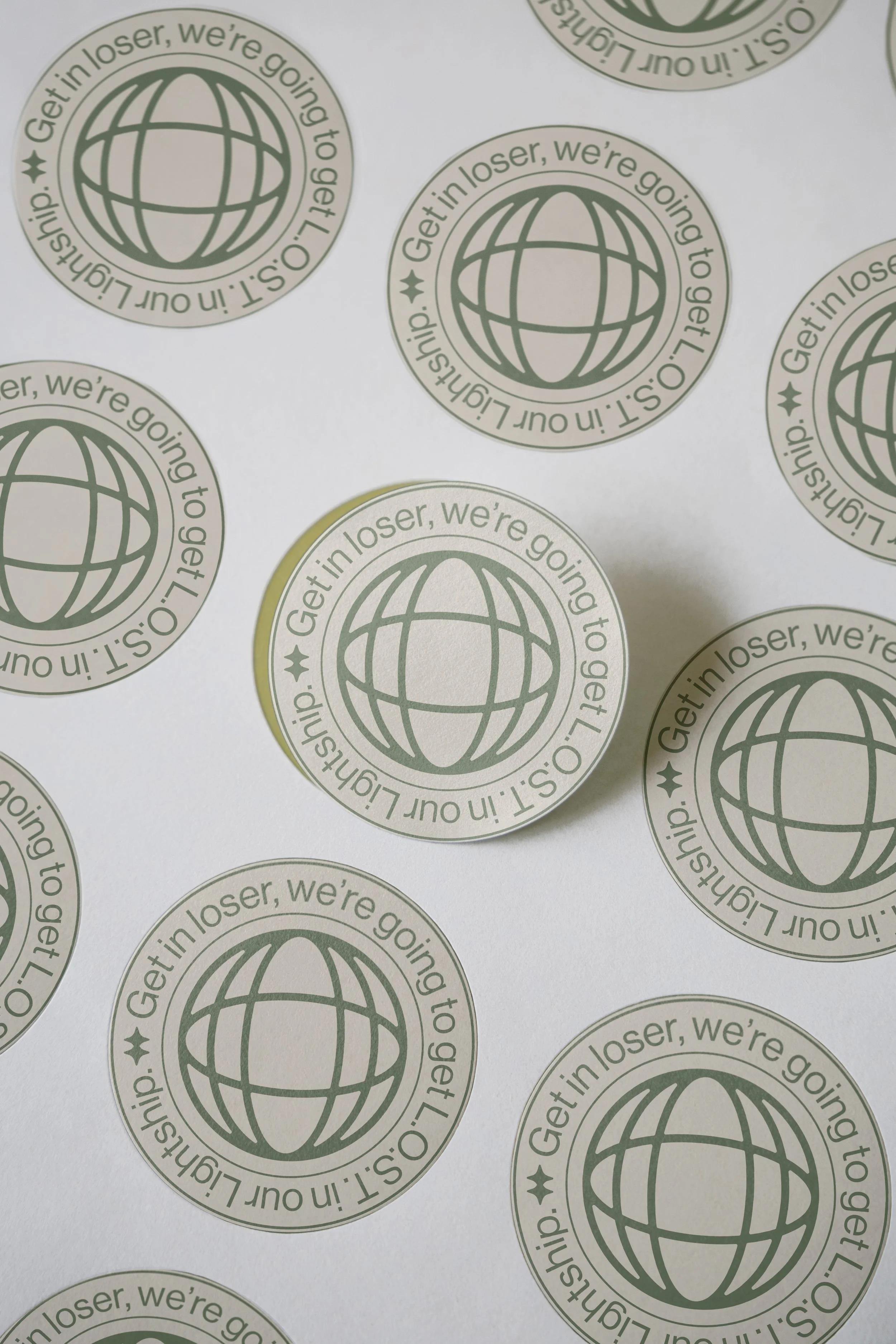
Illustrative icons The illustrative icons are designed as purposeful, pared-down symbols that feel lived-in and road-ready. They combine simple geometric forms with retro, weathered textures to reinforce the brand’s field-manual, utility aesthetic. Together, they visually expand the L.O.S.T. identity while reinforcing themes of exploration, belonging, and shared ownership.

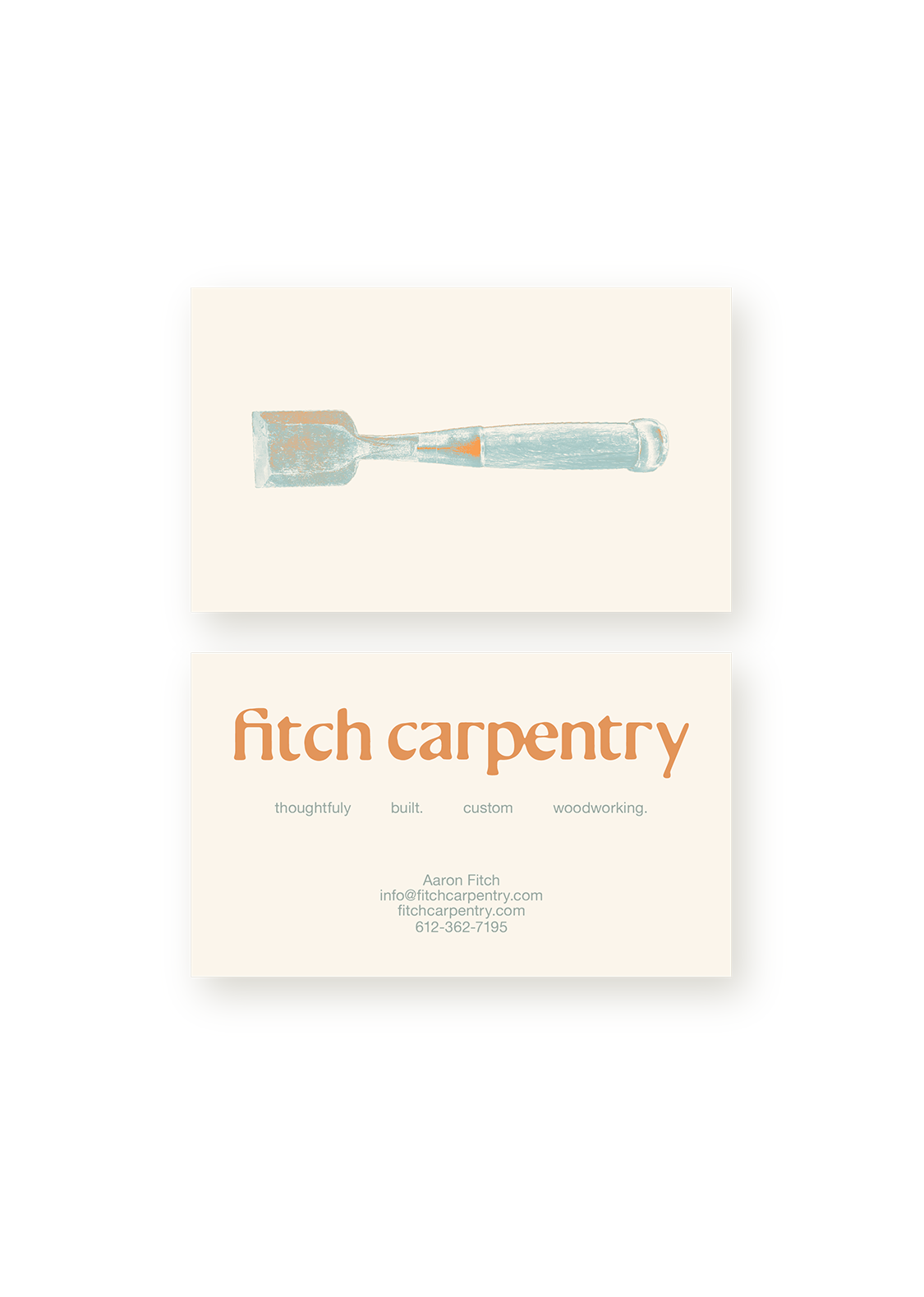
FITCH CARPENTRY
VISUAL IDENTITY
VISUAL IDENTITY FOR FITCH CARPENTRY
This visual identity design is for the carpentry and woodwork of Aaron Fitch. Fitch Carpentry exists to create meaningful, lasting spaces that foster awareness, connection and growth.
VISUAL DESIGN WORK INCLUDED:
logo design, custom typography, visual identity system, flyers, business cards, yard signage, website, work team apparel, photo assets, and social media content.


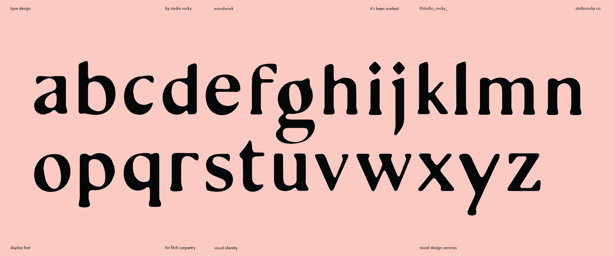


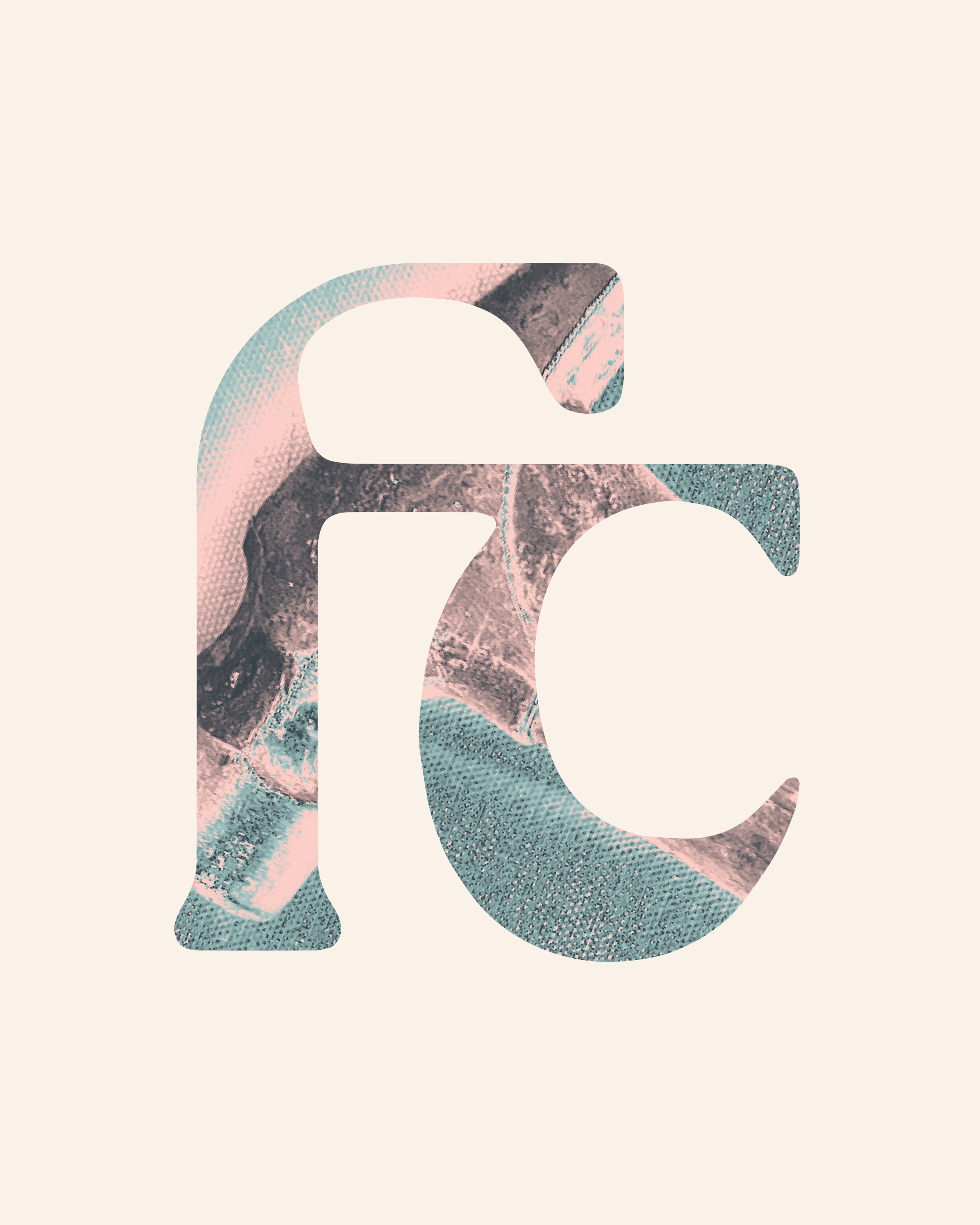

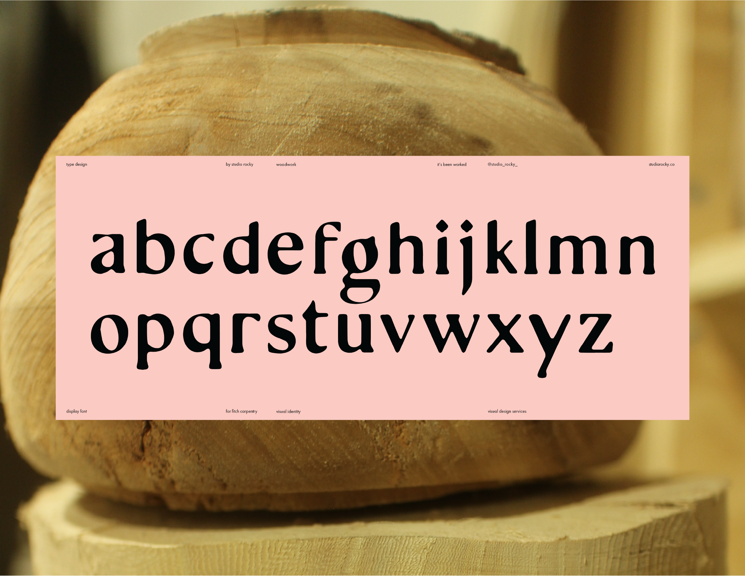
CUSTOM TYPOGRAPHY
This custom display typeface was created as part of the visual identity for Fitch Carpentry, a woodworking brand rooted in craft, intention, and time-earned skill. Designed by Studio Rocky, the type design draws direct inspiration from hand tools, woodcuts, and the generational nature of carpentry itself. Each letterform carries a subtle irregularity — slight flares, asymmetrical terminals, and unexpected angles that mimic the marks left behind by chisel, gouge, or grain.
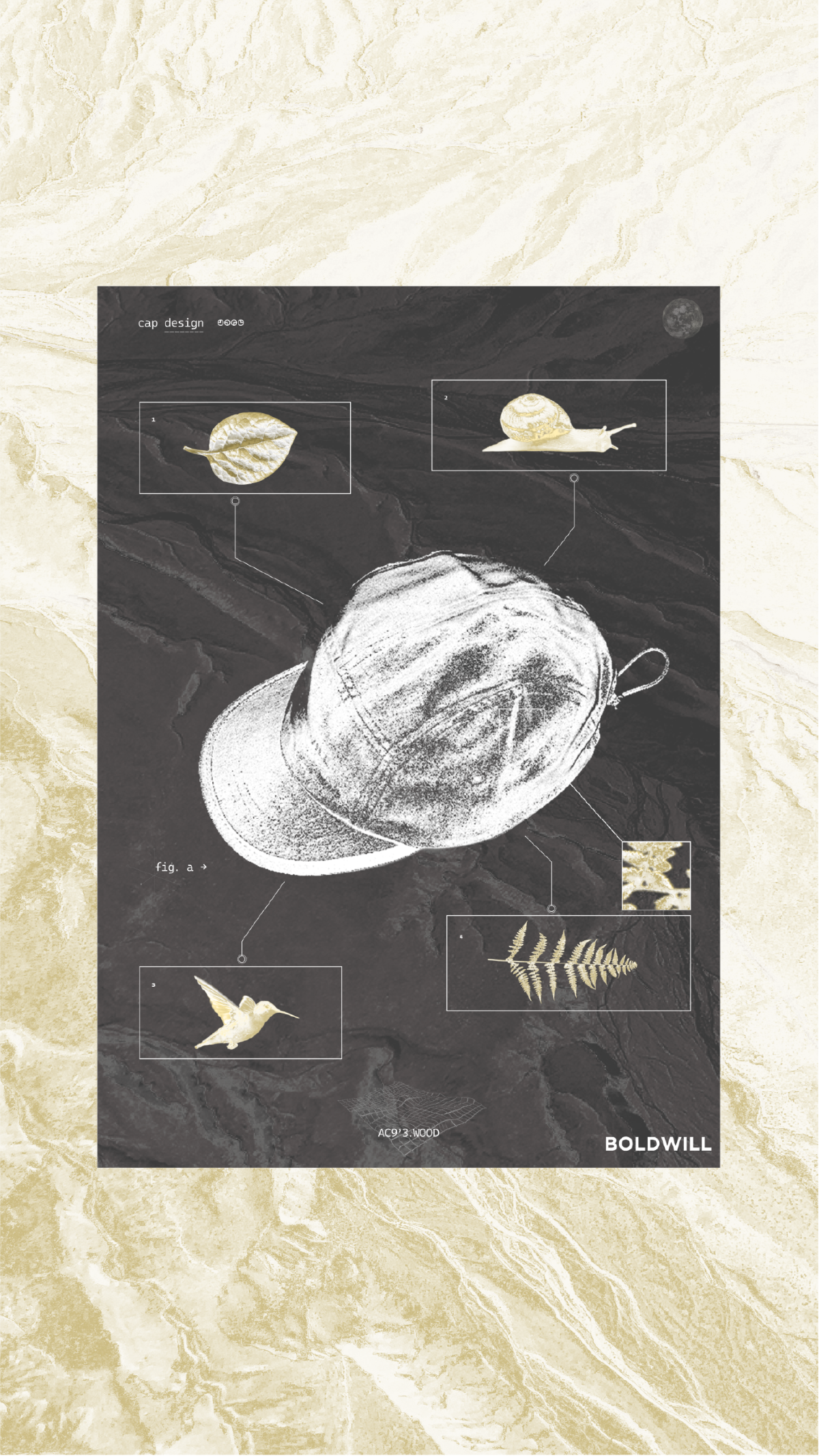
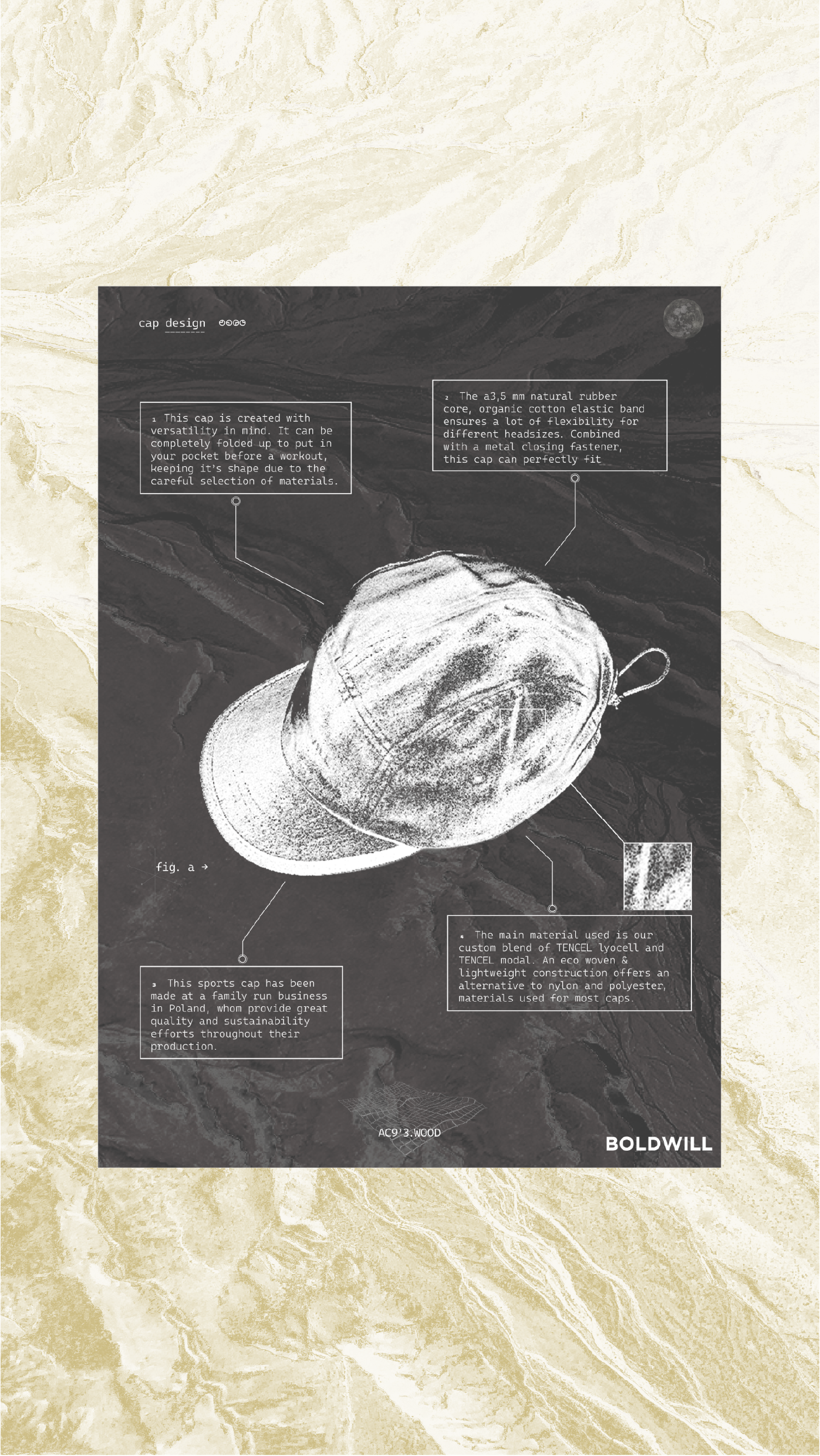
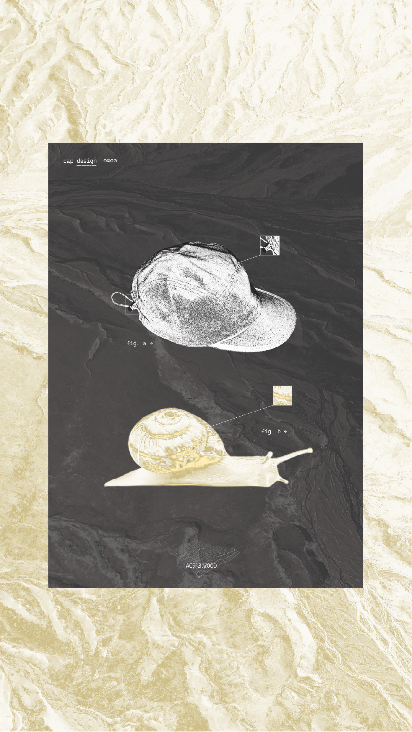
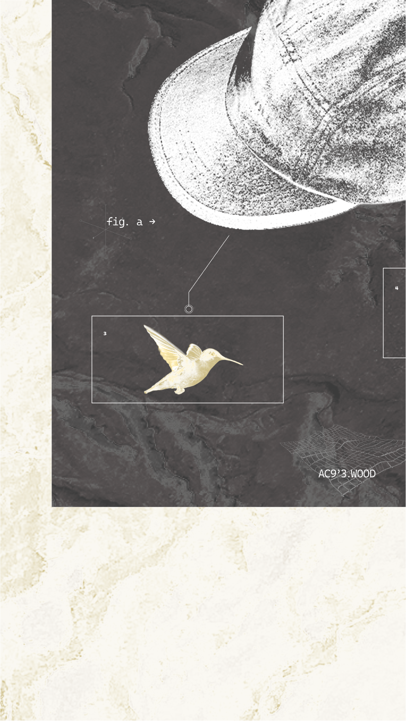
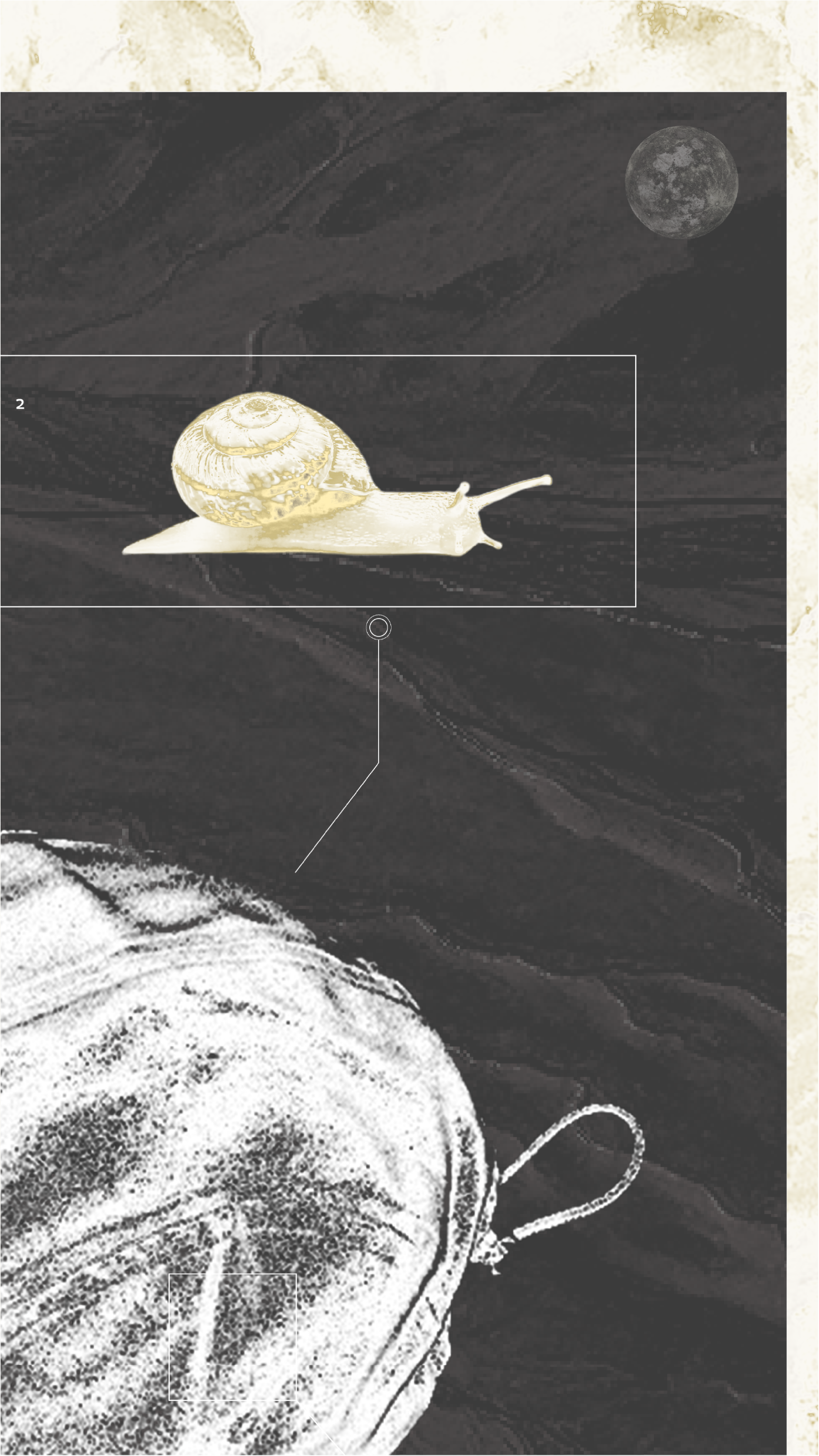
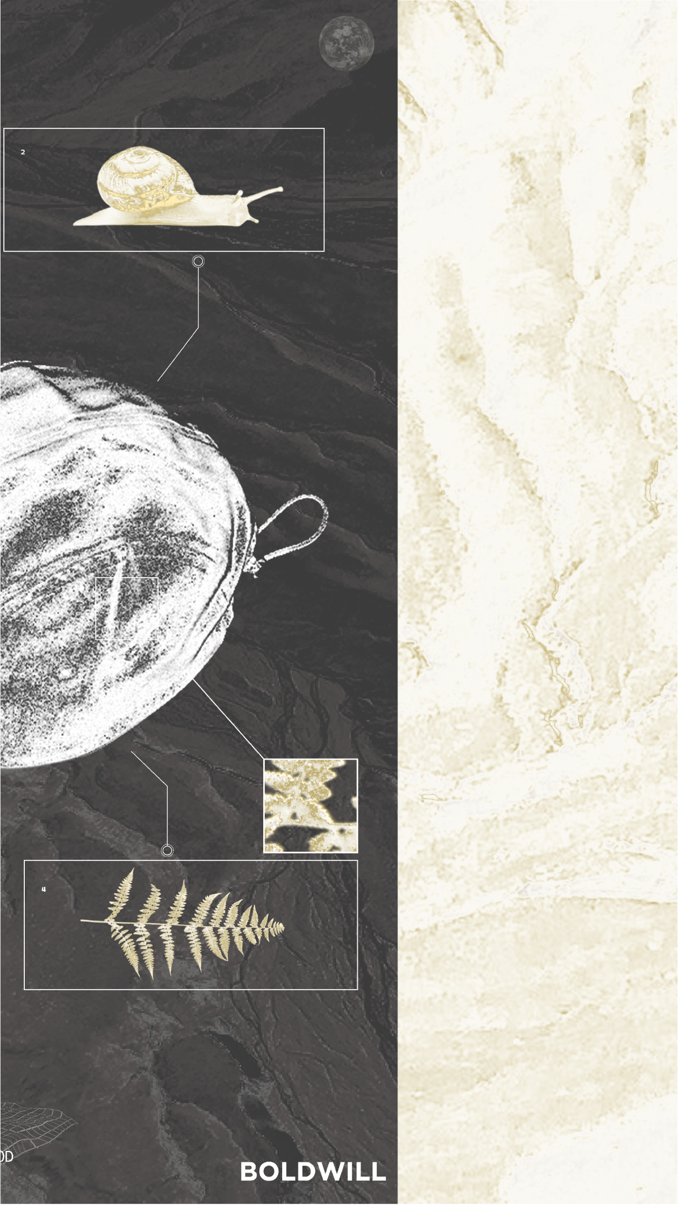
BOLDWILL
PRODUCT & WEB ASSETS
DIGITAL GRAPHICS FOR BOLDWILL
For Boldwill, I collaborated with their team to create some graphics for a product webpage to support the release of a new cap design.